COVID-19 Longitudinal Antibody Trajectory Analysis
1 Longitudinal Antibody Trajectory Dashboard
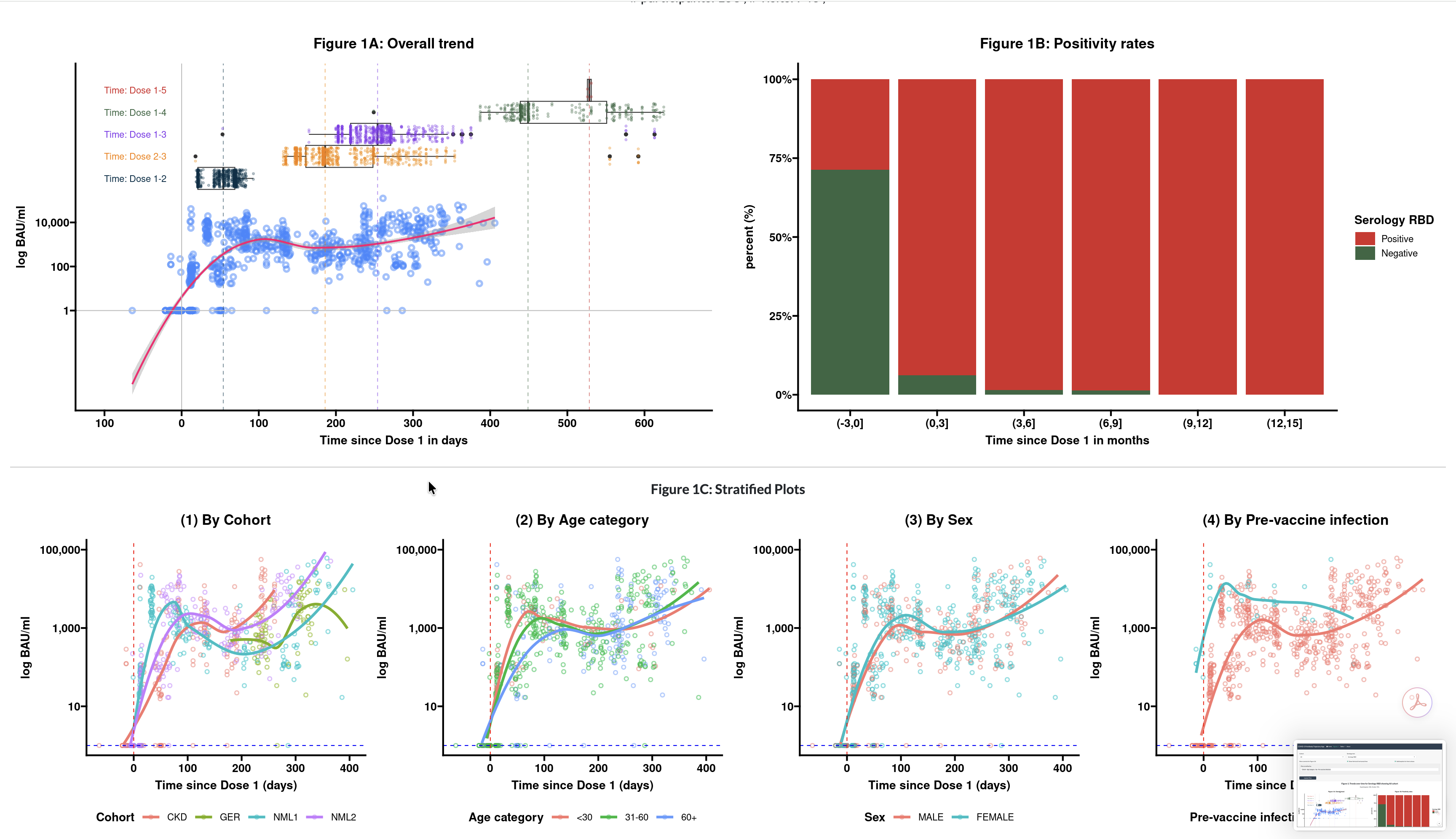
View Wireframe | View App Demos
Role: Lead Epidemiologist, Shiny Developer
Position: Postdoctoral Fellowship @ University of Manitoba
Domain: Immunology, Public Health, Infectious Disease
2 The Challenge
Tracking SARS-CoV-2 antibody durability across 3–5 booster doses generates high-dimensional, longitudinal datasets. With three types of serology antibodies and various neutralization responses to monitor, static reporting was insufficient. The research team needed a way to visualize complex immune decay patterns and “trajectories” to inform public health strategies and booster protocols in real-time.
3 The Solution
I developed a comprehensive Shiny application designed as a communication and analysis hub for cohort surveillance. This platform streamlines the transition from raw serological data to interactive longitudinal insights.
- Dynamic Trajectory Mapping: Built interactive visualizations that allow researchers to isolate specific cohorts and booster groups to observe immune trends.
- Multi-Dimensional Analysis: Integrated disparate outcomes (serology vs. neutralization) into a single, unified interface for comparative study.
- Engagement-Focused UI & Data Viz: Developed a user-friendly “wireframe-to-production” interface that simplifies statistical exploration for non-data scientists.
4 Technical Deep-Dive
- Longitudinal and Mixed-Effects Modeling: Leveraged R to calculate statistics across multiple time points and booster intervals.
- Tech Stack:
R,Shiny,ggplot2,plotly,tidyverse,lme4. - Impact: Served as the “comprehensive platform” for the study, enabling deep-dive collaborations with research partners and accelerating the dissemination of findings on long-term vaccine effectiveness.